Google Messages makes it easier to seamlessly stay connected to our loved ones, offering the most sought-after features and convenience to the audience. Google is heading towards a major change within the UI of Google Messages. The company has completely revamped the chat screen UI along with the bottom bar. With that, it seems like Google is on its way to revert this change.
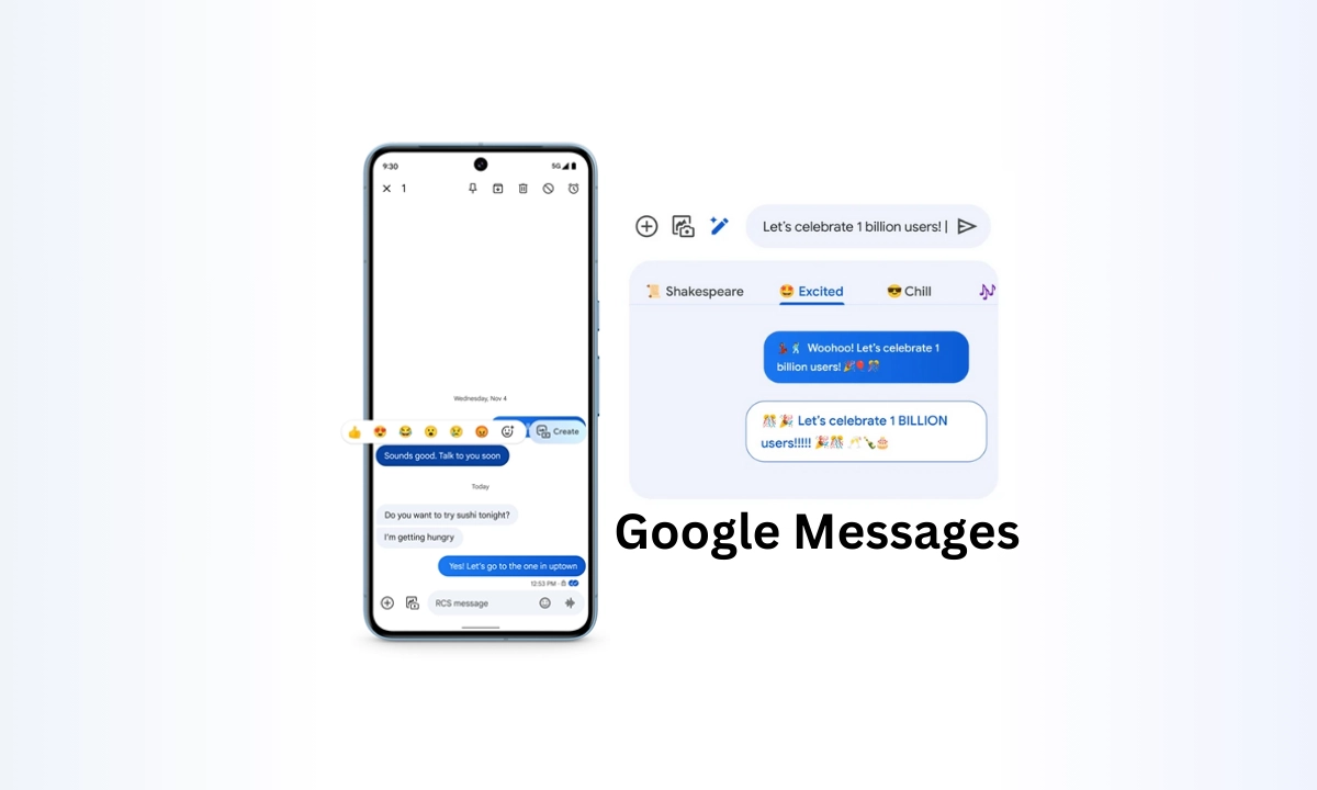
First spotted by TheSpAndroid, in the latest version of Google Messages beta having messages.android_20240404_01_RCO0.phone.open_beta_dynamic build version, Google has reverted the change that was made by the company earlier. This significantly brought back the single lined messages input box. Earlier, the message input box weirdly consisted of a double lined box, which certainly hovers over the message bar, while the second bar holded the emoji button, the attachment button, and the send button, respectively.

With the recently made change, now, users have a single lined input box, which looks exactly similar to what we witness on other messaging applications. This looks more accurate yet offers a much clean look as compared to the previous double-lined input box that arrived earlier.
You could only be able to see an attachment icon with no extra space left below the input box, which looks much better. It might be enabled through a feature flag, but it’s likely that Google will roll out this new change to all the users soon over the coming future.
“If you like this article follow us on Google News, Facebook, Telegram, and Twitter. We will keep bringing you such articles.”

